Task 1: Exploration
Exploration 😱
Basically...
This is the place where everything starts. The guide involves 3 tasks, starting with exploration where this post is about. Then, task two is visual analysis and ideation, task three is about development and design of the piece of art, and finally the last post is about final compilation and reflection writing. This post talks about some of the concepts of design principles, and below this file is the beginning.
MODULE INFORMATION GUIDE
TASK GUIDE
TASK 1
Part 1
GESTELT THEORY
This theory is a principle followed by professionals in the design field that originated in early 20th-century Germany. It states that the human brain perceives objects as a unified whole rather than as a sum of individual parts. This principle consists of many fundamental concepts from Gestalt psychology, a school of thought emphasizing how perception is organized. Figure 1 below shows the principles behind this theory.
 |
Figure 1: Visualizing the Gestalt theory principles such as closure, common fate, continuation, similarity, figure-ground, proximity, and symmetry. |
Principle of Similarity

Principle of Continuation

Principle of Closure

Principle of Proximity
By definition, proximity means nearness in space, time or relationship. In design principles, or in relevant field this is defined by how close the elements of design is to one another. A strong proximity lies in overlapping subjects and grouping objects in a focused area.
 |
| Figure 5: An illustration of the Gestalt principle of similarity |
Principle of Figure/Ground

 |
| Figure 7: An example of the Gestalt principle of common fate |

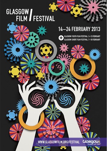
CONTRAST

 | ||
Figure 10: Visual Contrast - Example 2
|

 |
| Figure 12: Texture Contrast - Example 4 |

 |
| Figure 14: Shape and Form Contrast - Example 6 |
 |
| Figure 15: Temperature Contrast - Example 7 |
 |
| Figure 16: Line Contrast - Example 8 |


 |
| Figure 19: Style Contrast - Example 11 |
EMPHASIS
 |
| Figure 20: Emphasis - Example 1 |
 |
| Figure 21: Emphasis - Example 2 |
 |
| Figure 22: Emphasis - Example 3 |
BALANCE


Repetition occurs when the same or similar parts are used repeatedly in a design. This is not the same as a repeating pattern of visual elements. The visual style or artwork of the entire design project is more closely related to the use of visual elements as a pattern. Good design practice seeks to replicate specific design features in all works, regardless of how simple or complex they are. We use repetition to give a design a sense of consistency and cohesion. Repetition creates a certain style, coherence, attention, and hierarchy while also strengthening a design. If a design succeeds in communicating and insisting on a particular message that sticks and gets embedded, it will be fulfilling its purpose. Design repetition could be considered a kind of brainwashing. The more we see something, the more we recognize it and the more easily we can recall it. Whether we like it or not, repetition may make an impression on us. People are drawn to and comforted by familiarity.
 | |
| Figure 27: Repetition - Example 1 |


MOVEMENT
The design idea of movement allows artists to guide the viewer's gaze around a piece of art. To make a viewer involuntarily glance in a particular direction, painters, for example, will make routes throughout their artwork. Another technique to depict physical action on a still image is through movement, like when a character is escaping, dancing, or engaging in combat with another character.
 |
| Figure 31: Movement - Example 1 |
 |
| Figure 32: Movement - Example 2 |


HARMONY AND UNITY


SYMBOL
 | |
| Figure 45: Symbol - Example 1 |


WORD AND IMAGE
Words and images work better together in a design to communicate ideas than they do independently. Images create an immediate visual impression, whereas words provide context, direction, and clarity. When used well, they can create contrast for a humorous or emotional effect, improve meaning, or even function in harmony. This relationship is important in branding, visual storytelling, posters, and advertisements because it helps focus the viewer's attention and makes the message more memorable and compelling.
 |
| Figure 48: Words and Images - Example 1 |
 |
| Figure 49: Words and Images - Example 2 |
Part 2
SELECTED IMAGE
 |
Figure 52: Panos_Stamo. “Iron-Man Artwork.” r/Marvel, Reddit https://www.reddit.com/r/Marvel/comments/bbko0o/ironman_artwork/ |
My attention was drawn to this design right away because of its strong composition and the striking contrast between the tall, armored figure and the much tiny shape underneath it. The disparity in scale produces a powerful visual effect that almost seems to tell a story of inner strength, metamorphosis, or personal development.
While the lone human figure symbolizes vulnerability, ambition, and the yearning to become more, the armor itself seems to be a representation of strength, protection, and identification. The piece has emotional appeal and a sense of relevancy because of the way the two components work together.
I was especially intrigued using lighting to draw attention. The glowing chest immediately attracts attention and gives the entire design life, acting as a visual anchor. The vivid red and gold palette enhances the heroic tone and gives the character an iconic, futuristic aura. In addition to providing depth, movement, and a hint of chaos, the textured background contrasts nicely with the armor's elegant, well-polished design.
All things considered, the harmony of scale, color, light, and texture makes this work of art visually fascinating. Since it organically includes crucial design components like contrast, focus, balance, movement, and harmony, it is an excellent piece to examine for this project.
- Contrast
- Emphasis
- Balance
- Movement
- Repetition
- Harmony & Unity
- Gestalt Theory
- Symbol
Feedback
12 Feb 2026
- Advised not to use info graphic images, instead go for artworks.
- Bulleting's are fine, but try to be as brief and informative possible
- Guided how to embed the link to image source.
https://www.interaction-design.org/literature/article/the-laws-of-figure-ground-praegnanz-closure-and-common-fate-gestalt-principles-3?srsltid=AfmBOopzXMXCuiQJTU7zIDkNqAAj4zbxRW9WnnmFEMsJBvhvE9EAVd3B
https://www.simplypsychology.org/what-is-gestalt-psychology.html
https://www.kaarwan.com/blog/ui-ux-design/gestalt-principles-in-ui-design-creating-meaningful-user-experiences?id=1393
https://medium.com/design-bootcamp/to-understand-what-makes-good-design-work-you-need-to-understand-the-psychology-of-human-bdff3cf20425
https://www.behance.net/gallery/18122387/Gestalt-Principles/modules/122892149
https://www.ramotion.com/blog/emphasis-principle-in-design/
https://254-online.com/repetition-principle-of-design/
https://www.pluralsight.com/resources/blog/software-development/understanding-balance-graphic-design
https://www.wingedcanvas.com/single-post/unity-harmony-the-principles-of-design

Comments
Post a Comment